![]() Some rights reserved by jlai321
Some rights reserved by jlai321
A key component of most product rebrands is packaging, often the consumer’s first interaction with a product, and we all know how important packaging is within the purchasing journey and the emotional response it can elicit. But did you know it can make or break a rebrand and consequently hit sales?
A quick canvas of the office suggests that we are quick to remember name changes and major rebrands: “Opal Fruits to Starburst!”, “Jif became Cif!”, “Marathon to Snickers!” and even Google, Google tells me, began life as BackRub. “Let me BackRub that” – doesn’t have quite the same ring, does it?
In most of those examples, packaging design would’ve played a key role in the rebranding process. Indeed, a rebrand often takes place when a packaged product is perhaps not reaching desired sales levels or not engaging with the core audience in a way that the brand wants. And there’s plenty of evidence to suggest that overlooking the influence of packaging can backfire spectacularly!
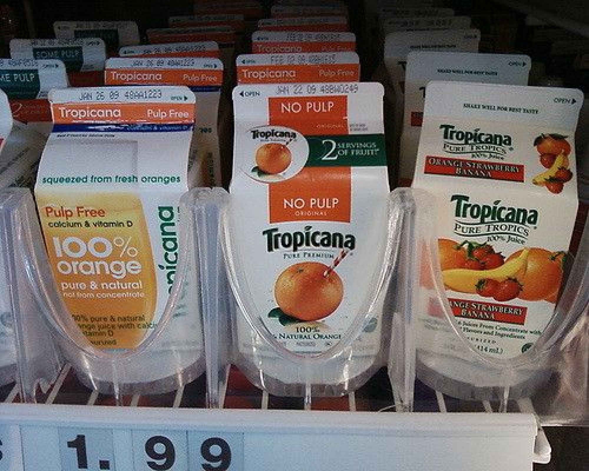
In 2009, Tropicana, undoubtedly the most famous fruit juice brand in the world, underwent a packaging rebrand to a more simplified, streamlined design, adding a rounded cap to represent the freshly squeezed oranges. After spending $30 million on an advertising campaign promoting the rebrand, sales dropped by 20%, resulting in an estimated $30 million loss for the brand – just six weeks after unveiling the new product, the old packaging was brought back.
What was it that consumers hated so much? It’s hard to say. But the emotional bond that loyal customers held to this older style of packaging is really quite astounding to consider, especially when you look at the $60 million it reportedly cost Tropicana.
While I personally prefer the newer design, it is a key example of packaging being a crucial element of a product’s success and recognition of a well-loved product in a design that did not speak to the consumer – a great case study of the power of packaging. But it doesn’t mean brands shouldn’t rebrand their packaging; they just need to be clear about why they’re doing it.
Take McDonald’s for instance. A couple of weeks ago, the fast-food behemoth introduced a complete packaging rebrand across its drinks containers and bags. A strong, bold typeface covers the majority of the paper bag, with the famous yellow arches taking precedence on the other side. Described as focusing on their core assets, the packaging is a lot less busy than previous versions and appears to be an attempt to modernise and convey a freshness and vitality.
While the jury is out on Maccy D’s new design, it’ll be interesting to see how it impacts sales and consumer perception over the coming months.
Do you have any examples of how packaging benefited or damaged a company’s rebrand? Let us know below!