![]() Some rights reserved by jbhthescots
Some rights reserved by jbhthescots
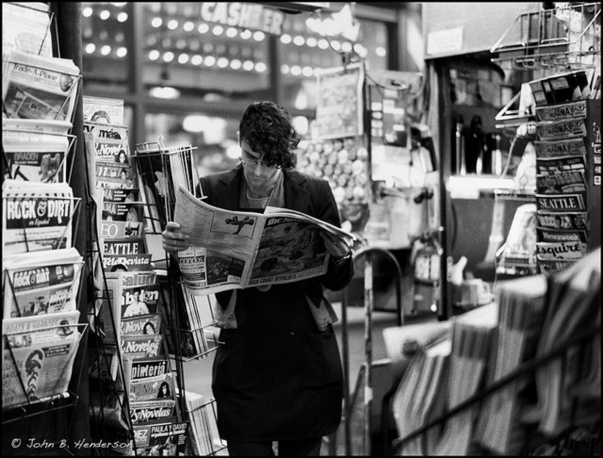
As AD’s receptionist, part of my role involves booking into our system all of the magazines that we receive on a daily basis; we get a stack of post, including a high volume of magazines and lots of packages (mainly for Greg!)
While taking each magazine out of its envelope or plastic cellophane, every now and again a front cover catches my eye and leaves me in awe. Today, for example, we received an Italian magazine – its front cover looked like the mother-board of a computer and when I picked it up I realised that you could actually pop this image out, and make your own little box!
It got me thinking, there are so many different ways to design and print, I wonder how the brands come up with their ideas and what they hope to achieve when these are used on magazine front covers?
Coming from a family full of Graphic Designers, I like to think I have an eye for spotting well designed pieces of work. I’m sure that inspiration can spark from something as innocuous as a dream, and that some of the best designers are stimulated by most things they look at.
I believe that covers must be the most sensitive and time-consuming part of a magazine issue from a design perspective. Each cover must achieve several goals: it must get noticed from among hundreds of others while sitting on a newsstand, adhere to print and postal code regulations, be interesting while still falling into alignment with brand standards, and — most of all— stand up to the scrutiny of the editorial team.
I imagine that all brands and publishers aspire to grab the attention of readers so that people are unable to turn the cover page for a few seconds due to being captivated by its beauty or cleverness, but how do they do that?
To me, there are 3 main points to make sure your magazine won’t be overlooked:
1. Look & feel – is the magazine eye catching enough to stand out from the rest – has it used interesting printing techniques?
2. The strap lines – do the messages say the right thing?
3. Image – does the cover image make people want to read further?
We’d love to see any magazine covers which have caught your eye, tweet us @adcomms.