When you’re walking through a bookshop or scrolling on a website to pick your next read, what are the attributes of a book that stand out? Is it the author? The title? Is it the genre? Do you pick based on recommendations or reviews? Or do you take the time to read the blurb of every book you set your eyes on?
As an avid book reader, I love wandering through a bookshop, picking up different books that stand out on the shelf. But it got me thinking about how, just like the title of this blog suggests, I often find myself ‘judging a book by its cover’.
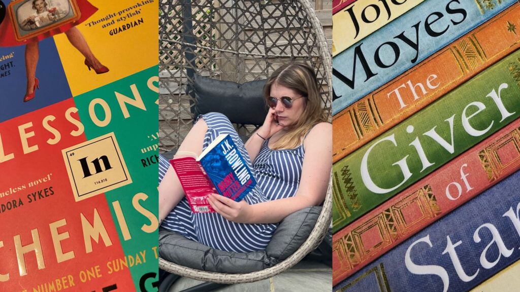
The font, the illustrations, and the colours – all the components of a well-designed book are what first appeal to us as consumers. They have a responsibility to start to tell us a story and give us a feel for what we can expect to read inside.
If I’m in the mood for a thriller, I’m naturally going to gravitate towards darker colours and mysterious imagery. On the other hand, if it’s a romance novel I’m after, I’ll more likely be drawn in by pinks, reds, yellows and pretty illustrations. If authors and publishers get this wrong – I’ll very likely look right past their book and pick up something else.
The BBC explained this perfectly in a recent article on their website: ‘What makes an iconic book cover?’ “Covers can be a swift way to signal genre,” the article stated. “But the good ones do more than that. They give a face to a book’s personality. They’re what will make you pick it up in the first place, then keep it on your shelf to remind you what it meant to you”. If you read a great book, it will stay with you and, if it’s done right, the cover will too.
And shops aren’t the only place books need to stand out now. As a result of the increase in online shopping and e-books, books need to be appealing in both print and online, including on e-reader platforms such as Kindle.
In addition, through more visual social media platforms such as Instagram and TikTok, there’s an increased emphasis on the way books look due to people sharing images of their current reads with #bookstagram or #booktok in the caption. On Instagram alone, you’re flooded with 85.5 million posts using #bookstagram to showcase aesthetically pleasing books in people’s homes, outdoors, in shops… the list goes on! On social media, the book covers that don’t ‘pop’ stand out for all the wrong reasons.
And, increasingly, I’ve noticed that it’s not just new book covers that are under scrutiny. Classic books are also being re-released with new covers or special edition jackets, aligning with consumer trends or the popular design styles at the time of release.
For all the reasons mentioned above, the design of a book is one of the most important marketing tools for a launch. If it’s not quite right, it’s likely to impact sales so it’s important to hit the mark.
Bookworm that I am, I’ve made this blog all about books, but the same points ring true for almost any other products on the shelf. The first part of any product seen by a consumer is the design or the packaging, so it’s got to be appealing if consumers in the target market are first going to notice it, and then going to want to buy it.
No matter how good your product – if the right people aren’t noticing it – or if they don’t like what they see when they do – then it’s not going anywhere.
Helping brands to stand out is what we do at AD – so if you think we can help you – then get in touch. If you’re looking for product marketing inspiration, take a look at our free download Expanding the product engagement toolbox