Photo: clogozm
With the Luxury Packaging Awards set to once again dazzle at the Grosvenor House Hotel tonight in London, I’ve had luxury packaging a lot on my mind lately and thought the best way to channel this glossy stream of consciousness was to pour my thoughts into a blog. But rather than wax lyrical about the latest trends and innovations in this glamorous sector, I was inspired to ponder on a more fascinating concept: what is it that makes some packaging so iconic?
I’m not talking about eye-catching designs or clever visual gimmicks (for those you can click here and here), but samples of packaging so unique and exemplary that you could argue they outshine the product itself. Sounds like the kind of arduous task that only a focus group of advertisers and marketing scholars on caffeine could pull off, right?
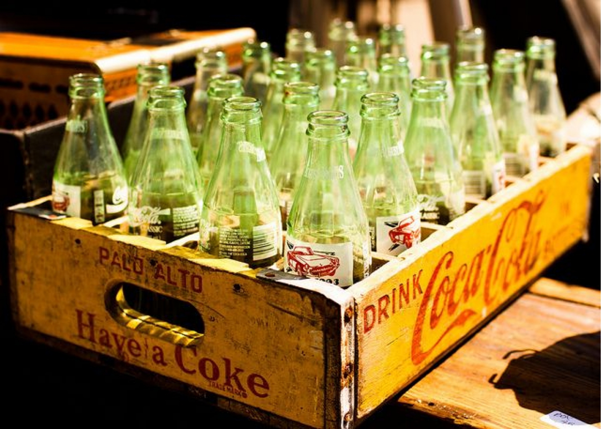
I had neither the funds nor the manpower to assemble such a team (plus, I’ve been given a tight deadline), so I had to settle for the next best thing, i.e. roll up by my colleagues’ desk and ask, point blank, what is the first sample of packaging they can think of. And the results were as revealing as they were varied. The Heinz beans can, the foldable McDonald’s Happy Meal box and Cadbury’s purple chocolate packaging all popped up in my ’walk-by’ survey, with only one item getting more votes than any other in the office: the Coca Cola bottle. The fact that said bottle also topped a survey recently commissioned by Easyfairs only proves its iconography further.
According to Forbes, the reason Coca Cola packaging stands out is because it “has an array of assets – the agitated red, the dynamic contour wave, the iconic bottle shape and the logo typography – that can all be used to help amplify the brand experience”. But I think there’s more to it than just impeccable brand design that appeals to our basic consumer instincts.
Upon revisiting my colleagues’ answers, it was clear their choices were tied somewhat to their past, meaning that emotional attachment factored somewhere in the equation. When asked why one colleague picked Nestlé’s Quality Street box of chocolates, she explained that the packaging had remained virtually unchanged since forever, was immediately recognisable and resonant, and that I’d be hard-pressed to find anyone who grew up in the ‘60s/’70s who didn’t have an emotional reaction to it.
Therefore it could be argued that innovative design alone cannot grant packaging iconic status – it needs to be ingrained to some extent in a culture’s subconscious. Once that happens, it becomes nigh impossible to dissociate it from our collective memories, a notion that is echoed in Bloom’s neat infographic.
What packaging do you consider to be iconic? Maybe we will be privileged enough to get a glimpse of the next generation of packaging icons at tonight’s awards.