You know a package is doing a good job when it manages to engage you in such a way that you’re inspired to buy the product. Take our Ellie for example, who recently purchased a Zewa box of tissues. She bought them not due to the brand’s credentials in the paper handkerchief sector, but because the box could be folded into the amusing shape of a pig. (That’s one for the consumer behaviour studies, right there).
With that in mind, here’s a list of some of the most eye-catching packaging designs that we’ve recently come across:
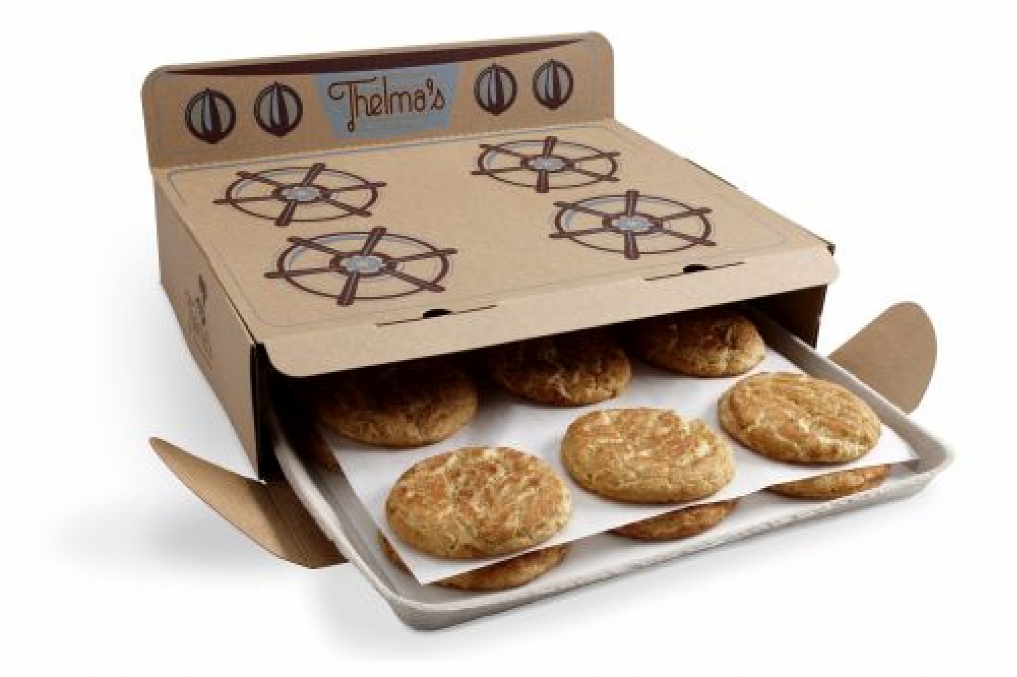
1) Thelma’s Treats: whoever cooked up this packaging design deserves a serious pat on the back, as a box of cookies is transformed into an oven-shaped package. Fills you with a warm and cosy feeling while also displaying the witty creativity that has bakers going “why didn’t I think of that?!”
2) GIGS.2.GO: here’s a design that’s both eco-friendly and highly practical. A tear-and-share flash drive bundle the size of a credit card, this nifty little data pack can fit in your wallet. Plus, it’s made of 100% post-consumer moulded paper pulp, meaning you can label the drive with a marker pen.
3) The Fruits Toilet Paper: we must admit, we don’t usually have a burning desire to discuss what type of toilet paper we prefer to use (how do you even start that conversation?), but this colourful range of rolls designed to look like fresh fruits might just be the exception!
4) Nike Air: A close relative of the bag of water, this bag of air containing a pair of trainers (or “sneakers”, depending on which side of the pond you’re on) displays a ruthlessly straightforward packaging design, yet brilliantly ties in with the brand identity associated with the product. The concept design is for Nike’s Air range – see what they did there?
5) Volksbier Pilsner: what’s better than being served a cold can of beer? A cold beer served in a can shaped like a stein glass, of course. Bonus points awarded for making you feel like you’ve been transported to the Oktoberfest.
But enough about our favourites… what are the quirky packaging designs that you have spotted recently?
