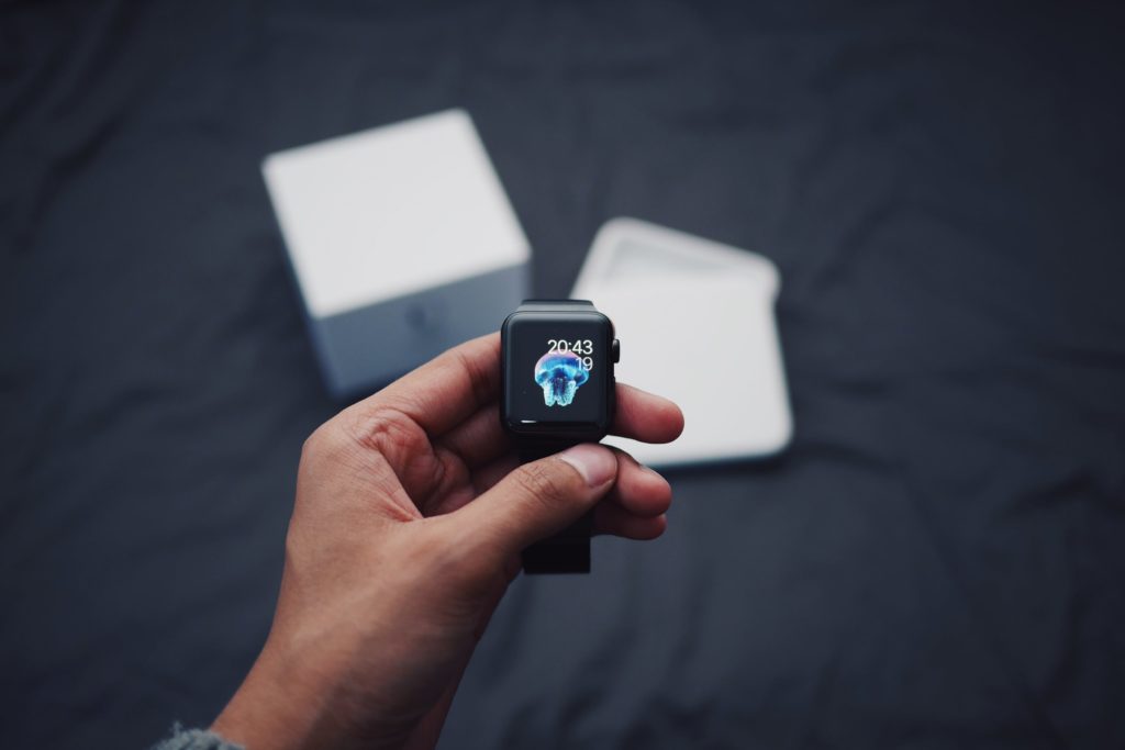
Over the past few years, unboxing videos have grown in popularity and remain some of the most-watched videos on the internet. YouTube now features almost 40 million unboxing videos, appealing to a range of audiences and markets – many of which have millions of views. The popularity of these videos not only highlights an opportunity for companies to increase brand awareness and be seen by a much wider audience, but also signifies the importance of a good unboxing experience for consumers.
So it came as a surprise to me that recent research by MacFarlane Packaging[1] revealed that there is still much room for improvement from online retailers when it comes to overall packaging. The research, which reviewed a number of brands from a range of industries, suggested that 61% of packaging surveyed had no branding inside or out, 55% did not reflect the value of the brand and 41% used too much packaging. These results indicate that many brands could be missing a trick when it comes to the unboxing phenomenon, which could impact on their social media presence and their sales.
There’s a fine line between getting the unboxing experience right and wrong. In my view, the following brands are getting it right.
- Glossybox: Some of the most popular and earliest “unboxing” videos to emerge on YouTube surrounded subscription box services such as Glossybox. Glossybox teams up with numerous brands on a monthly basis to surprise subscribers with an array of beauty-related products. As someone who has spent money on Glossybox in the past, I would look forward to receiving my items each month, which were wrapped in tissue paper and a pretty box that I could reuse for storage. The boxes would also include strongly-targeted printed promotional collateral, which not only nurtured the relationship I had with existing brands, but also encouraged me to try out products from others.
- Apple: This brand’s unboxing videos are some of the most popular on YouTube. Steve Jobs used the phrase that design is “not how it looks, but how it works.” – It’s therefore no surprise that Apple has its own “unboxing room” for employees to experiment with packaging. Apple’s sleek, minimalistic packaging gives the products a premium and luxurious feel in line with the company’s branding – making it stand out from competitor products. Similarly, the way the products are packaged once you open the box – neatly slotted in to compartments where they remain easy to see builds on the functionality of the packaging. In fact, the iPhone box was designed to only be opened slowly, which builds the anticipation of seeing what’s inside.
- Domino’s Pizza and Google Pixel[2]: A recent campaign caught my attention. The two companies teamed up to deliver both pizza and Pixel 4 boxes to a select group of 50 influencers in Domino’s pizza packaging that was designed to house the handset. It showcased the Pixel 4’s Motion Sense hands free functions, allowing users to grasp pizza while still operating the device. The mobile paraphernalia was stored in a ‘side orders’ box. It even urged users to order Domino’s through voice command, which is integrated through Google Assistant.
While this latter example was a limited promotional stunt rather than a mass market packaging solution, it points to the huge potential for packaging to make a brand ‘talkable’ and help to highlight key product selling points.
So it’s about time brands change the way they think about packaging. It’s no longer just about making a positive impression at the point of sale but also about overall brand association and shareability.
[1]Macfarlane Packaging.com, Unboxing
[2] thedrum.com, Domino’s Pizza and Google Pixel collab
